The Grid Is Back: How AI and Tech Brands Turned Graph Paper Into a Design Language

Open a few AI company homepages back to back. Anthropic. Perplexity. Vercel. Linear. What's sitting behind every hero image? A grid. Thin rules, faint dots, cyan blueprints, sometimes a whole wireframe cage holding the headline in place.
You've seen it. Your clients have started asking for it. Your feed is basically graph paper now. Here's why.
Why the grid came back
Grids used to live at the bottom of a design. Scaffolding. Something you built on and then hid. What changed is that brands stopped hiding them and started pulling them up to the surface.
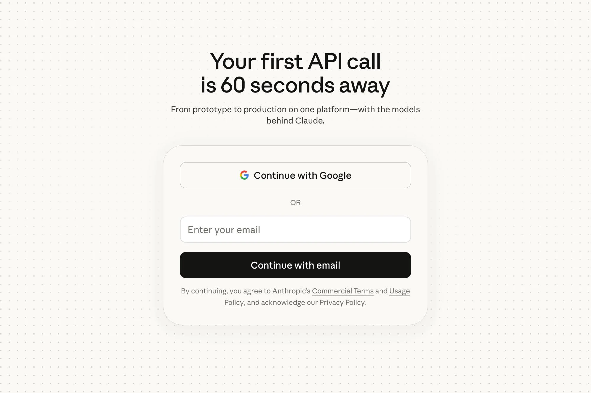
Claude Platform Homepage
Part of it is the software itself. The products getting marketed today are probabilistic, generative, and sometimes straight-up invisible. A chat that outputs an image. A model that drafts your email. An agent booking a flight for you. These things don't photograph well. There's no hardware to put in a commercial, no moving parts to film.
So brands reached for the oldest honest metaphor available: the technical drawing. The blueprint. The wireframe before it became a screen.
A grid says system. It says this was built on purpose, to spec, by people who knew what they were doing. In a moment when plenty of users quietly suspect software is being vibe-coded by a robot somewhere, that's a visual claim worth making.
It also fits neatly with the other moves in the same aesthetic family. Monospace fonts. Low-contrast dark mode. The Linear-style restraint that became default for anything developer-adjacent. Grids are the infrastructure holding all of that up.
The exhibit.
The trend has spread further than most trends do. Four different design lineages are reaching for the grid right now, and each is using it to say something a little different.
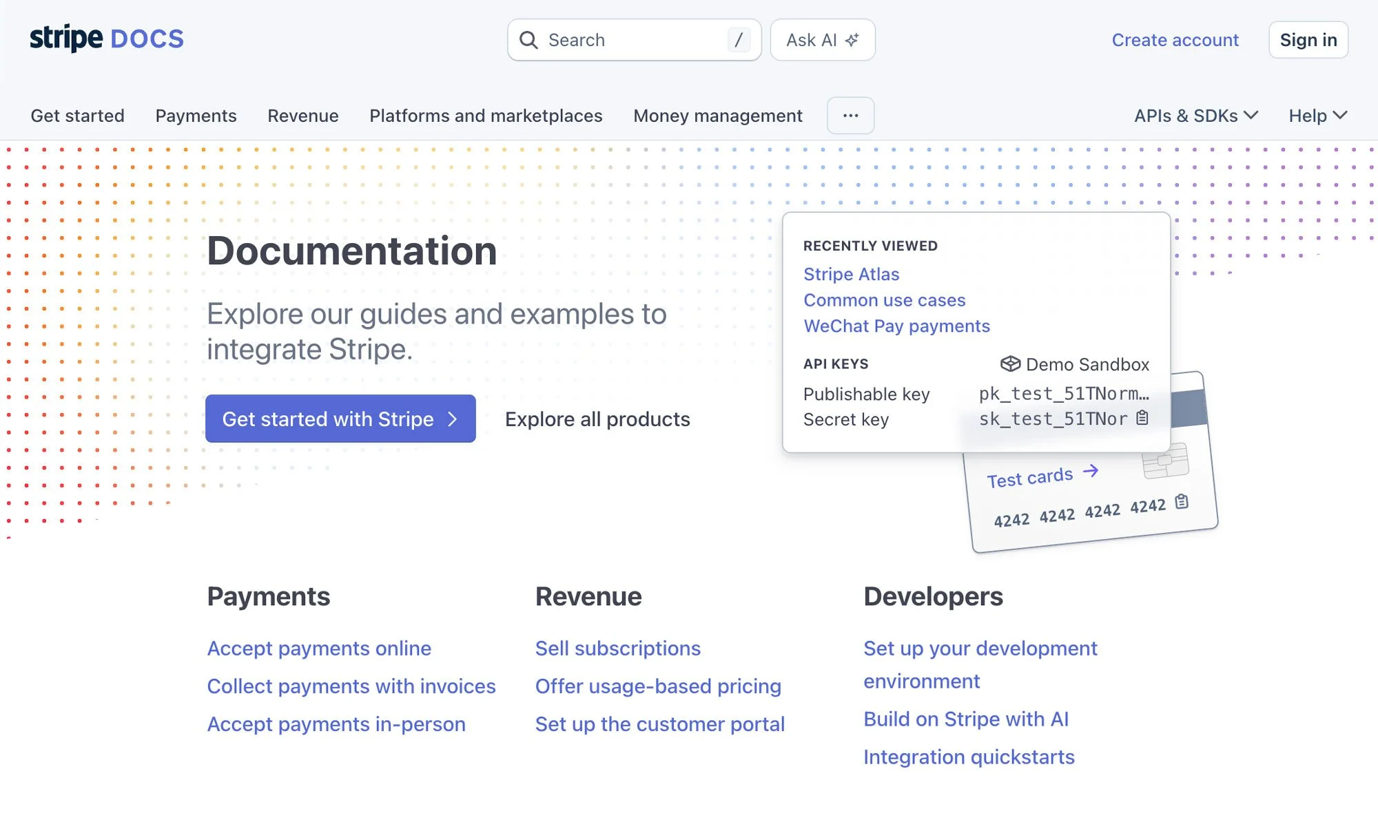
Stripe Documentation Homepage
AI-native brands use it for identity. Anthropic's Claude properties lean on structured, grid-informed layouts, and the recent Claude Design launch named grid systems and spatial composition as part of its core visual language. Perplexity's identity by Smith & Diction is one of the more honestly documented examples. The studio built a custom grid for marketing and decks, then sliced diagonal cuts through it so the system wouldn't sit still. The result is clean, deliberate, slightly Scandinavian-subway-system. Calm, but clearly engineered.
Dev and infra brands use it structurally. Stripe has run CSS grid as both skeleton and decoration for years, the grid doubling as the page and as part of what's on the page. Linear's language influenced enough sites that designers gave it a name — the Linear Look. Dark backgrounds, thin SVG lines, subtle grid patterns, bold sans-serif type, a general air of restraint. Vercel's Geist system ships a Grid component as a documented primitive. Supabase, Raycast, and a long tail of YC dev tools run versions of the same treatment. Here the grid is less metaphor and more professional signaling to an audience of engineers who will absolutely notice if something's off by two pixels.

Wireframe Type Slide
Hardware brands use it for honesty. Apple Vision Pro's marketing leaned on exploded diagrams and technical renders that read more like patent filings than ads. Framework, the repairable laptop company, turns the exploded-view schematic into its brand art. The grid here isn't decorative. It's telling you look, nothing to hide, here are the parts, here is the scale.
Creative and agency work uses it compositionally. Figma's own marketing is basically a live demo of grid-based layout. The Browser Company borrowed wireframe and grid motifs for Arc's product storytelling. Pentagram and similar studios have been building grid-led identity systems for decades. What shifted is that the grid stopped being the scaffolding you take down before shipping and became the finished surface.
What makes a grid land
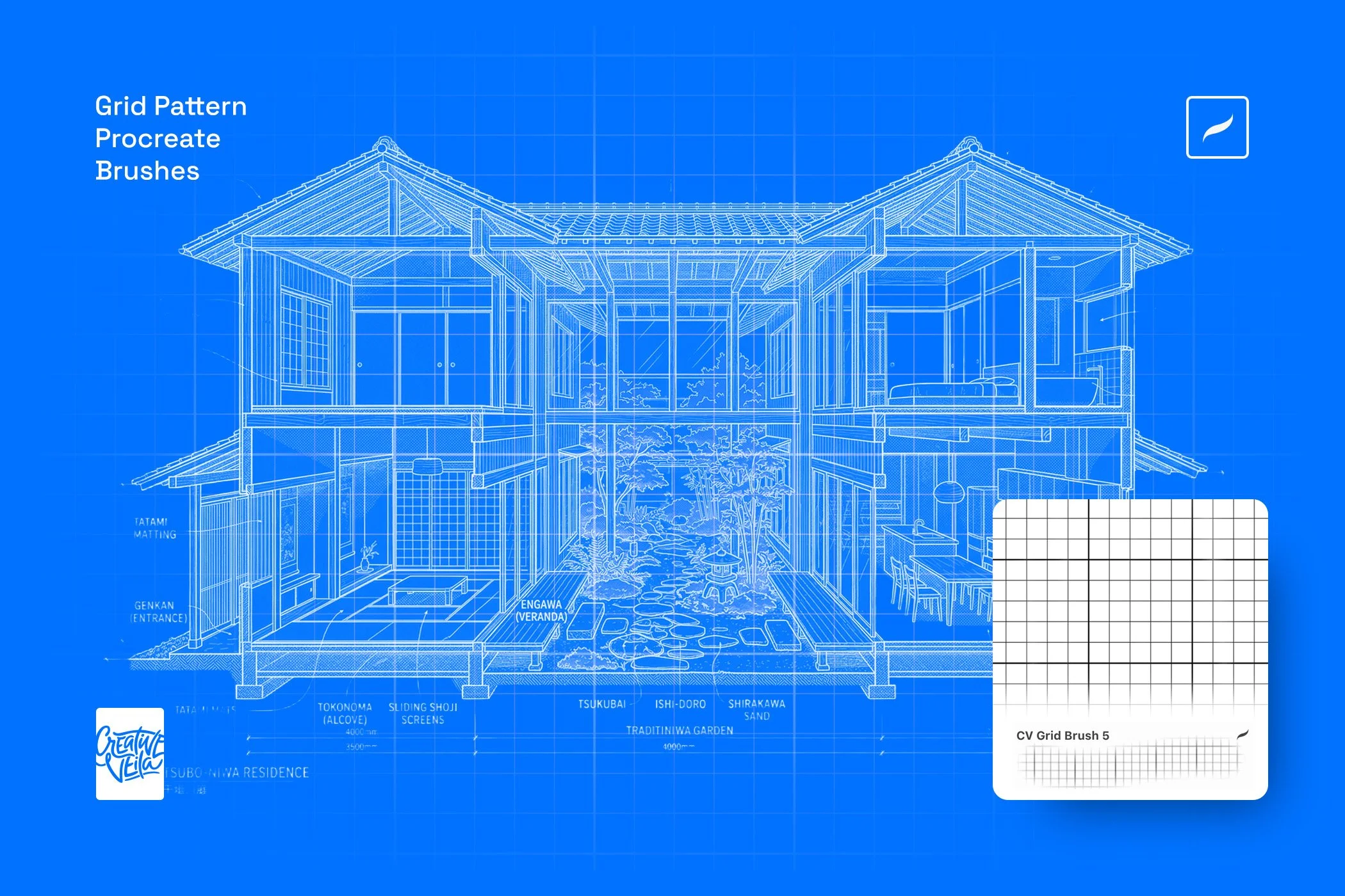
Grid Pattern Procreate Brushes Slide
The trend has gotten popular enough that it's flattening in places. A grid on your background is not, by itself, a design. A few things separate the ones that work from the ones that blur into one long scroll of sameness.
The type of grid matters more than most people realize. Dot grids read atmospheric, almost diffused. Quiet structure. Line grids read engineered, clean, a little clinical. Isometric grids add dimension and imply a world you could step into. Wireframe and blueprint treatments add narrative — the sense that what you're looking at is still being drawn. Mid-construction. Not done yet.
Contrast is the dial for volume. Low-contrast grids behave like texture and you can layer almost anything on top of them. High-contrast grids are a statement, and they demand the rest of the page quiet down around them.
The best grids also know when to break. A perfectly ruled field behind a perfectly centered headline is safe. A grid that fades, warps, or gets interrupted by a single off-axis element is where the eye actually catches.
Get the look
If you want to bring some of this into your next piece — a launch page, an editorial cover, a deck, a brand system — Veila has three tools built for exactly this moment.

Our bestseller, and for good reason. A full library of grid and geometry backgrounds in PSD, SVG, and transparent PNG, plus seamless Photoshop patterns. Works as a background, an overlay, or a texture layer.
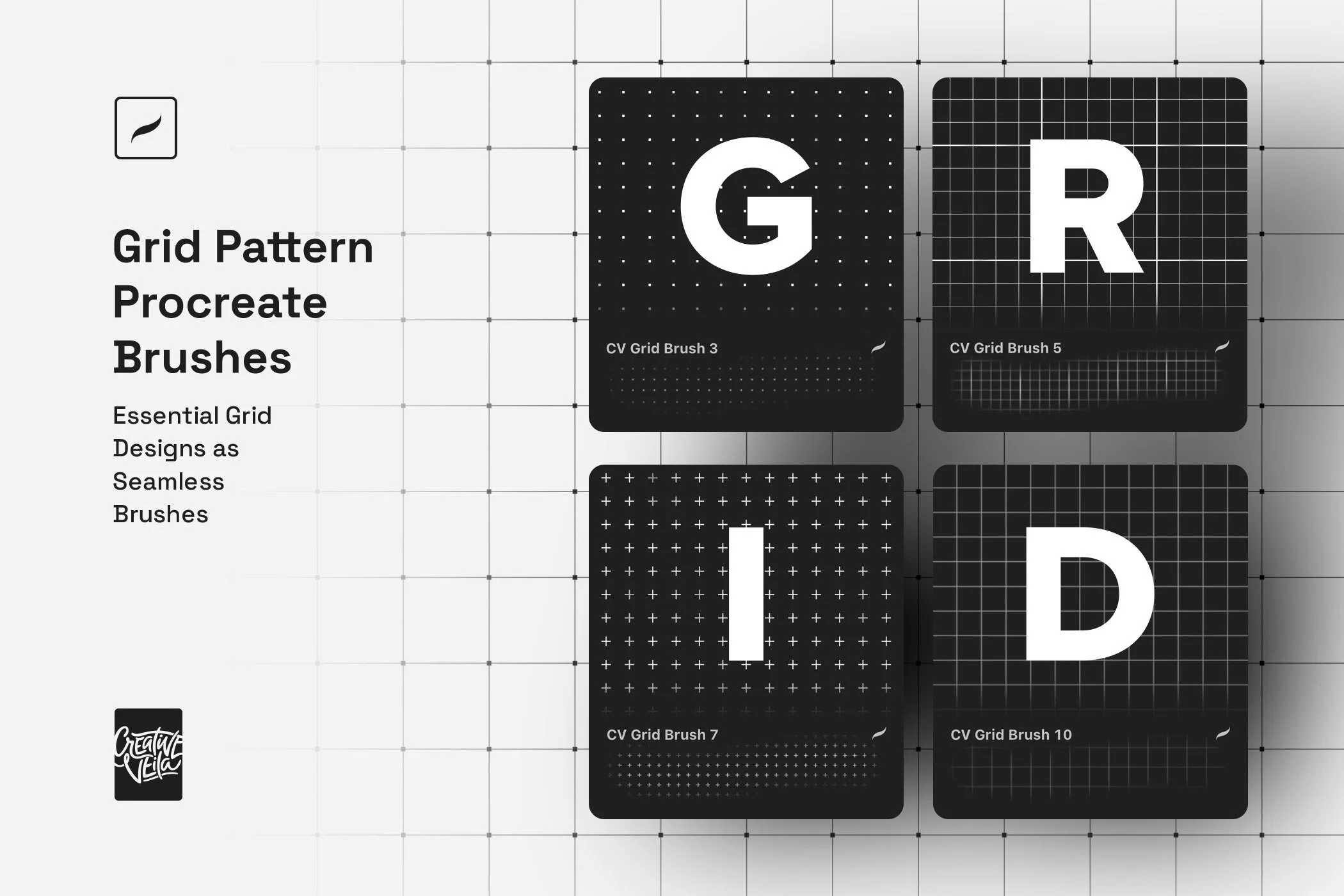
The pack brings the same visual language on-canvas. If you work in Procreate — iPad-first, illustrative, editorial — these let you paint and stamp grids directly instead of dropping in a static file.

The typography piece. It treats headlines the way a schematic treats a part number. Sharp, ruled, unmistakably technical. Useful when you want the type itself, not just the background, to carry the blueprint idea.
FAQs
What is the grid design trend in 2026?
A move toward making grid, dot, wireframe, and blueprint backgrounds the visible surface of a design, rather than the invisible scaffolding underneath. You'll see it most on AI product pages, developer tools, and hardware launches, often combined with monospace type and low-contrast dark mode.
Why are grid backgrounds popular with AI and tech brands?
Because AI products are abstract and often invisible, brands need visual shorthand that signals engineering, precision, and intention. A grid reads as system in a way gradients, glassmorphism, or photography don't. It also fits naturally with the monospace-and-minimalism aesthetic that dominates developer-facing design right now.
How do I add grid or blueprint backgrounds to my own designs?
The most direct route is a pre-made asset pack. Drop a grid PNG or SVG into Figma, Photoshop, or Illustrator and adjust opacity until it reads as texture. For painterly, iPad-first work, Procreate brushes give you more flexibility and let you paint the grid in. For type-led pieces, a blueprint text effect on the headline can carry the whole aesthetic without needing a heavy background behind it.
Are grid backgrounds just a passing trend?
The specific current flavor — cyan blueprints, thin-line fields behind hero shots — will date the way glassmorphism and brutalism did. The underlying idea of grid-forward design won't. Grids are one of the oldest structural tools in graphic design. What changes is how visible they are in any given era. Right now they're fully visible, and that's likely to hold for at least the rest of this AI design cycle.
What is the Linear Look?
An aesthetic named after the project tool Linear. Dark backgrounds, thin SVG lines and borders, subtle grid patterns, bold sans-serif typography, restrained gradients. It became the default style for a whole generation of developer tools and is one of the main reasons grids are so visible on the web today.
One more thought
Grids aren't new, and grids aren't really a trend in the strict sense. This is a visual language that was always sitting there, having its moment because the thing it describes — systems, infrastructure, things built on purpose — is exactly what a lot of brands want to say in 2026.
Use it while it's saying something. Then figure out what to break it with next.